Gem Color & Color Depth
Most materials let you pick the stone's body color freely; Color depth controls how quickly light traveling through the stone reaches that color in Realistic render. Together they're what separates a pale, washed-out tint from a deep, saturated one — using the exact same hex value.
Setting the body color
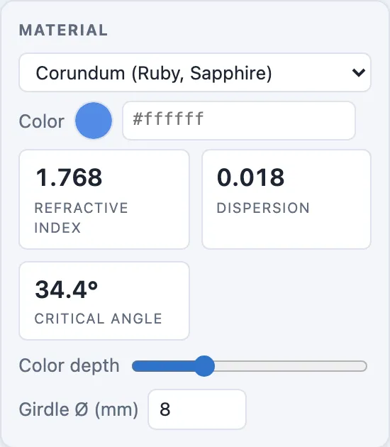
The Color row in the Material card has two linked controls: a color
swatch (#colorInput) and a hex text field (#colorHex) that always agree —
typing a hex value updates the swatch, and vice versa.
Note
Solid render mode always shows a neutral gray stone, regardless of this color — body color only appears in Realistic render, where the shader actually traces light through the gem. Switch render modes from the viewport's display bar.
Color depth
The slider below the stat tiles (range 0.1–5, default 1.5) sets how far a ray has to travel through the body before the chosen color fully saturates it.
A smaller depth means a shorter travel distance is enough to reach full color — so even a thin slice of the stone looks deeply saturated. A larger depth means light has to travel further before the tint shows, giving the same hex color a lighter, more washed look in a stone of the same size.
Tip
The default of 1.5 is tuned for typical ring-size stones (roughly 6–10mm). If a large stone renders unexpectedly dark, or a small one looks too pale for the color you picked, adjust color depth rather than changing the hex value — it's the control for "how saturated for this size," independent of "what color."
Note
Two materials set their own color and gray out the picker — Chrysoberyl (Alexandrite) and Opal. Color depth still applies to alexandrite. For opal, the milky body is set by Opacity below rather than by color depth, and the color flashes are the material's own — they don't move with either slider.
Opacity
Directly under Color depth sits Opacity (range 0–1). If color depth is "how saturated for this size," opacity is the neighboring question: how much you can see through the stone at all.
The slider runs the opposite way to the ones above it — fully opaque on the left, fully see-through on the right — because that's the order the words read in. All the way right is zero opacity: light passes straight through the body, every facet behind the one you're looking at shows through, and the stone renders exactly as it did before this control existed. That's the default for every material except opal.
Drag left and the body starts taking light out of the beam and glowing with it instead. Around the middle the stone reads translucent — you can still make out its interior structure, but softened, the way jade or moonstone looks. Keep going and the far facets disappear entirely; at the far left the stone is a lit solid, and what you see is its surface, not its insides.
Note
This is not transparency in the sense of seeing the background through the stone. The stone is always solid against whatever is behind it — opacity controls whether light gets through the body on its way to your eye.
Tip
Opacity works per unit of distance traveled, exactly as color depth does, so a large stone at a given setting reads more opaque than a small one — which is how real material behaves. If you resize a design significantly, re-check opacity along with color.
Like color and color depth, opacity is a Realistic-mode effect. Solid mode renders flat gray and models no light transport at all.
Why size matters here
Color depth isn't measured in millimeters; it's a tuning knob in the same scale the renderer already works in, independent of the Girdle Ø (mm) field in the same card. Two designs with identical color depth but different girdle sizes won't necessarily look equally saturated — if you resize a stone significantly, it's worth re-checking the color in Realistic render and nudging color depth back into a comfortable range.